A Data-Driven Approach To Cryptocurrency Speculation
How do Bitcoin markets behave? What are the causes of the sudden spikes and dips in cryptocurrency values? Are the markets for different altcoins inseparably linked or largely independent? How can we predict what will happen next?
Articles on cryptocurrencies, such as Bitcoin and Ethereum, are rife with speculation these days, with hundreds of self-proclaimed experts advocating for the trends that they expect to emerge. What is lacking from many of these analyses is a strong foundation of data and statistics to backup the claims.
The goal of this article is to provide an easy introduction to cryptocurrency analysis using Python. We will walk through a simple Python script to retrieve, analyze, and visualize data on different cryptocurrencies. In the process, we will uncover an interesting trend in how these volatile markets behave, and how they are evolving.
This is not a post explaining what cryptocurrencies are (if you want one, I would recommend this great overview), nor is it an opinion piece on which specific currencies will rise and which will fall. Instead, all that we are concerned about in this tutorial is procuring the raw data and uncovering the stories hidden in the numbers.
Step 1 - Setup Your Data Laboratory
The tutorial is intended to be accessible for enthusiasts, engineers, and data scientists at all skill levels. The only skills that you will need are a basic understanding of Python and enough knowledge of the command line to setup a project.
A completed version of the notebook with all of the results is available here.
Step 1.1 - Install Anaconda
The easiest way to install the dependencies for this project from scratch is to use Anaconda, a prepackaged Python data science ecosystem and dependency manager.
To setup Anaconda, I would recommend following the official installation instructions - https://www.continuum.io/downloads.
If you're an advanced user, and you don't want to use Anaconda, that's totally fine; I'll assume you don't need help installing the required dependencies. Feel free to skip to section 2.
Step 1.2 - Setup an Anaconda Project Environment
Once Anaconda is installed, we'll want to create a new environment to keep our dependencies organized.
Run conda create --name cryptocurrency-analysis python=3 to create a new Anaconda environment for our project.
Next, run source activate cryptocurrency-analysis (on Linux/macOS) or activate cryptocurrency-analysis (on windows) to activate this environment.
Finally, run conda install numpy pandas nb_conda jupyter plotly quandl to install the required dependencies in the environment. This could take a few minutes to complete.
Why use environments? If you plan on developing multiple Python projects on your computer, it is helpful to keep the dependencies (software libraries and packages) separate in order to avoid conflicts. Anaconda will create a special environment directory for the dependencies for each project to keep everything organized and separated.
Step 1.3 - Start An Interative Jupyter Notebook
Once the environment and dependencies are all set up, run jupyter notebook to start the iPython kernel, and open your browser to http://localhost:8888/. Create a new Python notebook, making sure to use the Python [conda env:cryptocurrency-analysis] kernel.
Step 1.4 - Import the Dependencies At The Top of The Notebook
Once you've got a blank Jupyter notebook open, the first thing we'll do is import the required dependencies.
import os
import numpy as np
import pandas as pd
import pickle
import quandl
from datetime import datetime
We'll also import Plotly and enable the offline mode.
import plotly.offline as py
import plotly.graph_objs as go
import plotly.figure_factory as ff
py.init_notebook_mode(connected=True)
Step 2 - Retrieve Bitcoin Pricing Data
Now that everything is set up, we're ready to start retrieving data for analysis. First, we need to get Bitcoin pricing data using Quandl's free Bitcoin API.
Step 2.1 - Define Quandl Helper Function
To assist with this data retrieval we'll define a function to download and cache datasets from Quandl.
def get_quandl_data(quandl_id):
    '''Download and cache Quandl dataseries'''
    cache_path = '{}.pkl'.format(quandl_id).replace('/','-')
    try:
        f = open(cache_path, 'rb')
        df = pickle.load(f)
        print('Loaded {} from cache'.format(quandl_id))
    except (OSError, IOError) as e:
        print('Downloading {} from Quandl'.format(quandl_id))
        df = quandl.get(quandl_id, returns="pandas")
        df.to_pickle(cache_path)
        print('Cached {} at {}'.format(quandl_id, cache_path))
    return df
We're using pickle to serialize and save the downloaded data as a file, which will prevent our script from re-downloading the same data each time we run the script. The function will return the data as a Pandas dataframe. If you're not familiar with dataframes, you can think of them as super-powered spreadsheets.
Step 2.2 - Pull Kraken Exchange Pricing Data
Let's first pull the historical Bitcoin exchange rate for the Kraken Bitcoin exchange.
# Pull Kraken BTC price exchange data
btc_usd_price_kraken = get_quandl_data('BCHARTS/KRAKENUSD')
We can inspect the first 5 rows of the dataframe using the head() method.
btc_usd_price_kraken.head()
| Open | High | Low | Close | Volume (BTC) | Volume (Currency) | Weighted Price | |
|---|---|---|---|---|---|---|---|
| Date | |||||||
| 2014-01-07 | 874.67040 | 892.06753 | 810.00000 | 810.00000 | 15.622378 | 13151.472844 | 841.835522 |
| 2014-01-08 | 810.00000 | 899.84281 | 788.00000 | 824.98287 | 19.182756 | 16097.329584 | 839.156269 |
| 2014-01-09 | 825.56345 | 870.00000 | 807.42084 | 841.86934 | 8.158335 | 6784.249982 | 831.572913 |
| 2014-01-10 | 839.99000 | 857.34056 | 817.00000 | 857.33056 | 8.024510 | 6780.220188 | 844.938794 |
| 2014-01-11 | 858.20000 | 918.05471 | 857.16554 | 899.84105 | 18.748285 | 16698.566929 | 890.671709 |
Next, we'll generate a simple chart as a quick visual verification that the data looks correct.
# Chart the BTC pricing data
btc_trace = go.Scatter(x=btc_usd_price_kraken.index, y=btc_usd_price_kraken['Weighted Price'])
py.iplot([btc_trace])
Here, we're using Plotly for generating our visualizations. This is a less traditional choice than some of the more established Python data visualization libraries such as Matplotlib, but I think Plotly is a great choice since it produces fully-interactive charts using D3.js. These charts have attractive visual defaults, are easy to explore, and are very simple to embed in web pages.
As a quick sanity check, you should compare the generated chart with publicly available graphs on Bitcoin prices(such as those on Coinbase), to verify that the downloaded data is legit.
Step 2.3 - Pull Pricing Data From More BTC Exchanges
You might have noticed a hitch in this dataset - there are a few notable down-spikes, particularly in late 2014 and early 2016. These spikes are specific to the Kraken dataset, and we obviously don't want them to be reflected in our overall pricing analysis.
The nature of Bitcoin exchanges is that the pricing is determined by supply and demand, hence no single exchange contains a true "master price" of Bitcoin. To solve this issue, along with that of down-spikes (which are likely the result of technical outages and data set glitches) we will pull data from three more major Bitcoin exchanges to calculate an aggregate Bitcoin price index.
First, we will download the data from each exchange into a dictionary of dataframes.
# Pull pricing data for 3 more BTC exchanges
exchanges = ['COINBASE','BITSTAMP','ITBIT']

exchange_data = {}

exchange_data['KRAKEN'] = btc_usd_price_kraken

for exchange in exchanges:
    exchange_code = 'BCHARTS/{}USD'.format(exchange)
    btc_exchange_df = get_quandl_data(exchange_code)
    exchange_data[exchange] = btc_exchange_df
Step 2.4 - Merge All Of The Pricing Data Into A Single Dataframe
Next, we will define a simple function to merge a common column of each dataframe into a new combined dataframe.
def merge_dfs_on_column(dataframes, labels, col):
    '''Merge a single column of each dataframe into a new combined dataframe'''
    series_dict = {}
    for index in range(len(dataframes)):
        series_dict[labels[index]] = dataframes[index][col]

    return pd.DataFrame(series_dict)
Now we will merge all of the dataframes together on their "Weighted Price" column.
# Merge the BTC price dataseries' into a single dataframe
btc_usd_datasets = merge_dfs_on_column(list(exchange_data.values()), list(exchange_data.keys()), 'Weighted Price')
Finally, we can preview last five rows the result using the tail() method, to make sure it looks ok.
btc_usd_datasets.tail()
| BITSTAMP | COINBASE | ITBIT | KRAKEN | |
|---|---|---|---|---|
| Date | ||||
| 2017-08-14 | 4210.154943 | 4213.332106 | 4207.366696 | 4213.257519 |
| 2017-08-15 | 4101.447155 | 4131.606897 | 4127.036871 | 4149.146996 |
| 2017-08-16 | 4193.426713 | 4193.469553 | 4190.104520 | 4187.399662 |
| 2017-08-17 | 4338.694675 | 4334.115210 | 4334.449440 | 4346.508031 |
| 2017-08-18 | 4182.166174 | 4169.555948 | 4175.440768 | 4198.277722 |
The prices look to be as expected: they are in similar ranges, but with slight variations based on the supply and demand of each individual Bitcoin exchange.
Step 2.5 - Visualize The Pricing Datasets
The next logical step is to visualize how these pricing datasets compare. For this, we'll define a helper function to provide a single-line command to generate a graph from the dataframe.
def df_scatter(df, title, seperate_y_axis=False, y_axis_label='', scale='linear', initial_hide=False):
    '''Generate a scatter plot of the entire dataframe'''
    label_arr = list(df)
    series_arr = list(map(lambda col: df[col], label_arr))

    layout = go.Layout(
        title=title,
        legend=dict(orientation="h"),
        xaxis=dict(type='date'),
        yaxis=dict(
            title=y_axis_label,
            showticklabels= not seperate_y_axis,
            type=scale
        )
    )

    y_axis_config = dict(
        overlaying='y',
        showticklabels=False,
        type=scale )

    visibility = 'visible'
    if initial_hide:
        visibility = 'legendonly'

    # Form Trace For Each Series
    trace_arr = []
    for index, series in enumerate(series_arr):
        trace = go.Scatter(
            x=series.index,
            y=series,
            name=label_arr[index],
            visible=visibility
        )

        # Add seperate axis for the series
        if seperate_y_axis:
            trace['yaxis'] = 'y{}'.format(index + 1)
            layout['yaxis{}'.format(index + 1)] = y_axis_config
        trace_arr.append(trace)

    fig = go.Figure(data=trace_arr, layout=layout)
    py.iplot(fig)
In the interest of brevity, I won't go too far into how this helper function works. Check out the documentation for Pandas and Plotly if you would like to learn more.
We can now easily generate a graph for the Bitcoin pricing data.
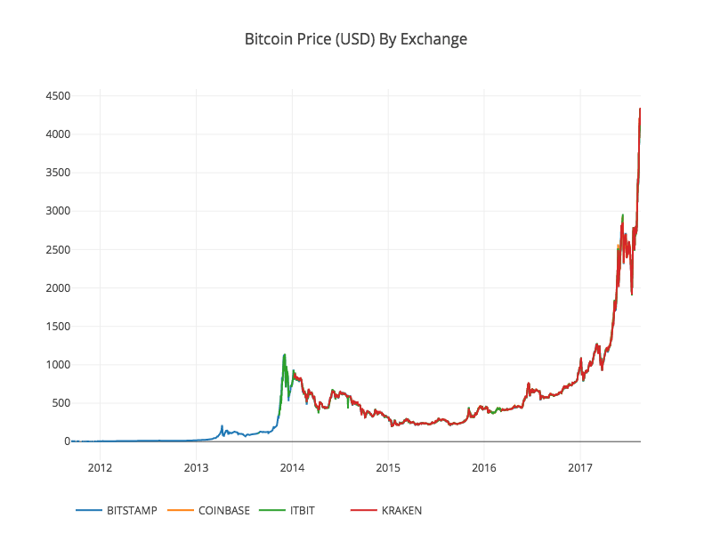
# Plot all of the BTC exchange prices
df_scatter(btc_usd_datasets, 'Bitcoin Price (USD) By Exchange')
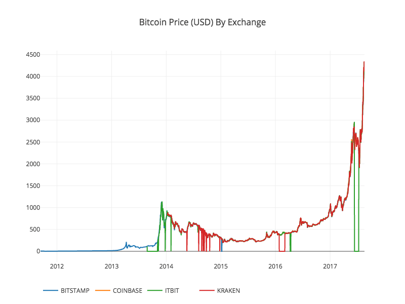
Step 2.6 - Clean and Aggregate the Pricing Data
We can see that, although the four series follow roughly the same path, there are various irregularities in each that we'll want to get rid of.
Let's remove all of the zero values from the dataframe, since we know that the price of Bitcoin has never been equal to zero in the timeframe that we are examining.
# Remove "0" values
btc_usd_datasets.replace(0, np.nan, inplace=True)
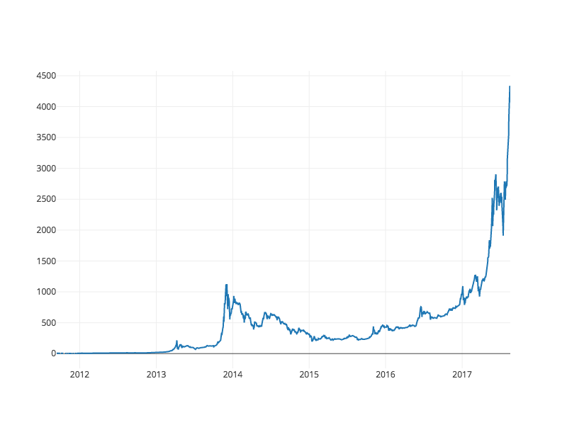
When we re-chart the dataframe, we'll see a much cleaner looking chart without the down-spikes.
# Plot the revised dataframe
df_scatter(btc_usd_datasets, 'Bitcoin Price (USD) By Exchange')
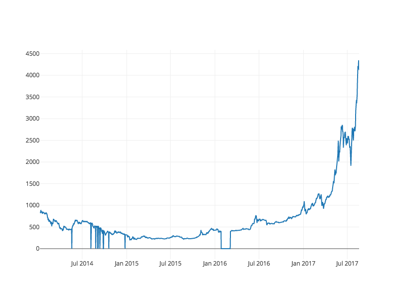
We can now calculate a new column, containing the average daily Bitcoin price across all of the exchanges.
# Calculate the average BTC price as a new column
btc_usd_datasets['avg_btc_price_usd'] = btc_usd_datasets.mean(axis=1)
This new column is our Bitcoin pricing index! Let's chart that column to make sure it looks ok.
# Plot the average BTC price
btc_trace = go.Scatter(x=btc_usd_datasets.index, y=btc_usd_datasets['avg_btc_price_usd'])
py.iplot([btc_trace])
Yup, looks good. We'll use this aggregate pricing series later on, in order to convert the exchange rates of other cryptocurrencies to USD.
Step 3 - Retrieve Altcoin Pricing Data
Now that we have a solid time series dataset for the price of Bitcoin, let's pull in some data for non-Bitcoin cryptocurrencies, commonly referred to as altcoins.
Step 3.1 - Define Poloniex API Helper Functions
For retrieving data on cryptocurrencies we'll be using the Poloniex API. To assist in the altcoin data retrieval, we'll define two helper functions to download and cache JSON data from this API.
First, we'll define get_json_data, which will download and cache JSON data from a provided URL.
def get_json_data(json_url, cache_path):
    '''Download and cache JSON data, return as a dataframe.'''
    try:
        f = open(cache_path, 'rb')
        df = pickle.load(f)
        print('Loaded {} from cache'.format(json_url))
    except (OSError, IOError) as e:
        print('Downloading {}'.format(json_url))
        df = pd.read_json(json_url)
        df.to_pickle(cache_path)
        print('Cached {} at {}'.format(json_url, cache_path))
    return df
Next, we'll define a function that will generate Poloniex API HTTP requests, and will subsequently call our new get_json_data function to save the resulting data.
base_polo_url = 'https://poloniex.com/public?command=returnChartData¤cyPair={}&start={}&end={}&period={}'
start_date = datetime.strptime('2015-01-01', '%Y-%m-%d') # get data from the start of 2015
end_date = datetime.now() # up until today
pediod = 86400 # pull daily data (86,400 seconds per day)
def get_crypto_data(poloniex_pair):
'''Retrieve cryptocurrency data from poloniex'''
json_url = base_polo_url.format(poloniex_pair, start_date.timestamp(), end_date.timestamp(), pediod)
data_df = get_json_data(json_url, poloniex_pair)
data_df = data_df.set_index('date')
return data_df
This function will take a cryptocurrency pair string (such as 'BTC_ETH') and return a dataframe containing the historical exchange rate of the two currencies.
Step 3.2 - Download Trading Data From Poloniex
Most altcoins cannot be bought directly with USD; to acquire these coins individuals often buy Bitcoins and then trade the Bitcoins for altcoins on cryptocurrency exchanges. For this reason, we'll be downloading the exchange rate to BTC for each coin, and then we'll use our existing BTC pricing data to convert this value to USD.
We'll download exchange data for nine of the top cryptocurrencies -
Ethereum, Litecoin, Ripple, Ethereum Classic, Stellar, Dash, Siacoin, Monero, and NEM.
altcoins = ['ETH','LTC','XRP','ETC','STR','DASH','SC','XMR','XEM']

altcoin_data = {}
for altcoin in altcoins:
    coinpair = 'BTC_{}'.format(altcoin)
    crypto_price_df = get_crypto_data(coinpair)
    altcoin_data[altcoin] = crypto_price_df
Now we have a dictionary with 9 dataframes, each containing the historical daily average exchange prices between the altcoin and Bitcoin.
We can preview the last few rows of the Ethereum price table to make sure it looks ok.
altcoin_data['ETH'].tail()
| close | high | low | open | quoteVolume | volume | weightedAverage | |
|---|---|---|---|---|---|---|---|
| date | |||||||
| 2017-08-18 12:00:00 | 0.070510 | 0.071000 | 0.070170 | 0.070887 | 17364.271529 | 1224.762684 | 0.070533 |
| 2017-08-18 16:00:00 | 0.071595 | 0.072096 | 0.070004 | 0.070510 | 26644.018123 | 1893.136154 | 0.071053 |
| 2017-08-18 20:00:00 | 0.071321 | 0.072906 | 0.070482 | 0.071600 | 39655.127825 | 2841.549065 | 0.071657 |
| 2017-08-19 00:00:00 | 0.071447 | 0.071855 | 0.070868 | 0.071321 | 16116.922869 | 1150.361419 | 0.071376 |
| 2017-08-19 04:00:00 | 0.072323 | 0.072550 | 0.071292 | 0.071447 | 14425.571894 | 1039.596030 | 0.072066 |
Step 3.3 - Convert Prices to USD
Now we can combine this BTC-altcoin exchange rate data with our Bitcoin pricing index to directly calculate the historical USD values for each altcoin.
# Calculate USD Price as a new column in each altcoin dataframe
for altcoin in altcoin_data.keys():
    altcoin_data[altcoin]['price_usd'] =  altcoin_data[altcoin]['weightedAverage'] * btc_usd_datasets['avg_btc_price_usd']
Here, we've created a new column in each altcoin dataframe with the USD prices for that coin.
Next, we can re-use our merge_dfs_on_column function from earlier to create a combined dataframe of the USD price for each cryptocurrency.
# Merge USD price of each altcoin into single dataframe
combined_df = merge_dfs_on_column(list(altcoin_data.values()), list(altcoin_data.keys()), 'price_usd')
Easy. Now let's also add the Bitcoin prices as a final column to the combined dataframe.
# Add BTC price to the dataframe
combined_df['BTC'] = btc_usd_datasets['avg_btc_price_usd']
Now we should have a single dataframe containing daily USD prices for the ten cryptocurrencies that we're examining.
Let's reuse our df_scatter function from earlier to chart all of the cryptocurrency prices against each other.
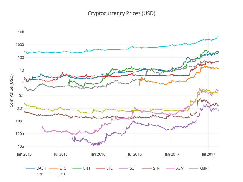
# Chart all of the altocoin prices
df_scatter(combined_df, 'Cryptocurrency Prices (USD)', seperate_y_axis=False, y_axis_label='Coin Value (USD)', scale='log')
Nice! This graph provides a pretty solid "big picture" view of how the exchange rates for each currency have varied over the past few years.
Note that we're using a logarithmic y-axis scale in order to compare all of the currencies on the same plot. You are welcome to try out different parameter values here (such as
scale='linear') to get different perspectives on the data.
Step 3.4 - Perform Correlation Analysis
You might notice is that the cryptocurrency exchange rates, despite their wildly different values and volatility, look slightly correlated. Especially since the spike in April 2017, even many of the smaller fluctuations appear to be occurring in sync across the entire market.
A visually-derived hunch is not much better than a guess until we have the stats to back it up.
We can test our correlation hypothesis using the Pandas corr() method, which computes a Pearson correlation coefficient for each column in the dataframe against each other column.
Revision Note 8/22/2017 - This section has been revised in order to use the daily return percentages instead of the absolute price values in calculating the correlation coefficients.
Computing correlations directly on a non-stationary time series (such as raw pricing data) can give biased correlation values. We will work around this by first applying the pct_change() method, which will convert each cell in the dataframe from an absolute price value to a daily return percentage.
First we'll calculate correlations for 2016.
# Calculate the pearson correlation coefficients for cryptocurrencies in 2016
combined_df_2016 = combined_df[combined_df.index.year == 2016]
combined_df_2016.pct_change().corr(method='pearson')
| DASH | ETC | ETH | LTC | SC | STR | XEM | XMR | XRP | BTC | |
|---|---|---|---|---|---|---|---|---|---|---|
| DASH | 1.000000 | 0.003992 | 0.122695 | -0.012194 | 0.026602 | 0.058083 | 0.014571 | 0.121537 | 0.088657 | -0.014040 |
| ETC | 0.003992 | 1.000000 | -0.181991 | -0.131079 | -0.008066 | -0.102654 | -0.080938 | -0.105898 | -0.054095 | -0.170538 |
| ETH | 0.122695 | -0.181991 | 1.000000 | -0.064652 | 0.169642 | 0.035093 | 0.043205 | 0.087216 | 0.085630 | -0.006502 |
| LTC | -0.012194 | -0.131079 | -0.064652 | 1.000000 | 0.012253 | 0.113523 | 0.160667 | 0.129475 | 0.053712 | 0.750174 |
| SC | 0.026602 | -0.008066 | 0.169642 | 0.012253 | 1.000000 | 0.143252 | 0.106153 | 0.047910 | 0.021098 | 0.035116 |
| STR | 0.058083 | -0.102654 | 0.035093 | 0.113523 | 0.143252 | 1.000000 | 0.225132 | 0.027998 | 0.320116 | 0.079075 |
| XEM | 0.014571 | -0.080938 | 0.043205 | 0.160667 | 0.106153 | 0.225132 | 1.000000 | 0.016438 | 0.101326 | 0.227674 |
| XMR | 0.121537 | -0.105898 | 0.087216 | 0.129475 | 0.047910 | 0.027998 | 0.016438 | 1.000000 | 0.027649 | 0.127520 |
| XRP | 0.088657 | -0.054095 | 0.085630 | 0.053712 | 0.021098 | 0.320116 | 0.101326 | 0.027649 | 1.000000 | 0.044161 |
| BTC | -0.014040 | -0.170538 | -0.006502 | 0.750174 | 0.035116 | 0.079075 | 0.227674 | 0.127520 | 0.044161 | 1.000000 |
These correlation coefficients are all over the place. Coefficients close to 1 or -1 mean that the series' are strongly correlated or inversely correlated respectively, and coefficients close to zero mean that the values are not correlated, and fluctuate independently of each other.
To help visualize these results, we'll create one more helper visualization function.
def correlation_heatmap(df, title, absolute_bounds=True):
    '''Plot a correlation heatmap for the entire dataframe'''
    heatmap = go.Heatmap(
        z=df.corr(method='pearson').as_matrix(),
        x=df.columns,
        y=df.columns,
        colorbar=dict(title='Pearson Coefficient'),
    )

    layout = go.Layout(title=title)

    if absolute_bounds:
        heatmap['zmax'] = 1.0
        heatmap['zmin'] = -1.0

    fig = go.Figure(data=[heatmap], layout=layout)
    py.iplot(fig)
correlation_heatmap(combined_df_2016.pct_change(), "Cryptocurrency Correlations in 2016")
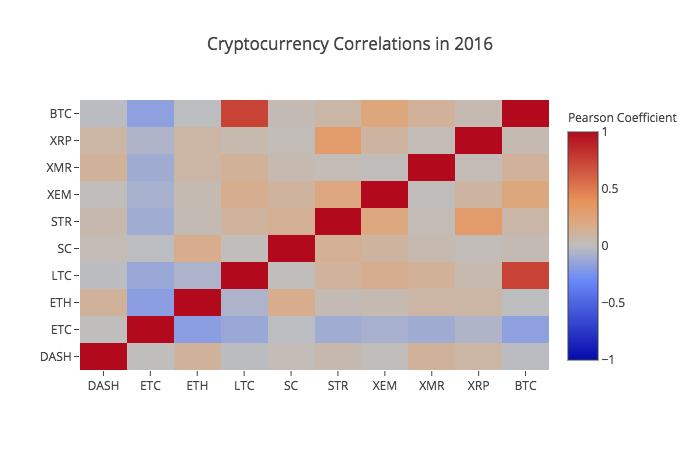
Here, the dark red values represent strong correlations (note that each currency is, obviously, strongly correlated with itself), and the dark blue values represent strong inverse correlations. All of the light blue/orange/gray/tan colors in-between represent varying degrees of weak/non-existent correlations.
What does this chart tell us? Essentially, it shows that there was little statistically significant linkage between how the prices of different cryptocurrencies fluctuated during 2016.
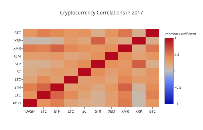
Now, to test our hypothesis that the cryptocurrencies have become more correlated in recent months, let's repeat the same test using only the data from 2017.
combined_df_2017 = combined_df[combined_df.index.year == 2017]
combined_df_2017.pct_change().corr(method='pearson')
| DASH | ETC | ETH | LTC | SC | STR | XEM | XMR | XRP | BTC | |
|---|---|---|---|---|---|---|---|---|---|---|
| DASH | 1.000000 | 0.384109 | 0.480453 | 0.259616 | 0.191801 | 0.159330 | 0.299948 | 0.503832 | 0.066408 | 0.357970 |
| ETC | 0.384109 | 1.000000 | 0.602151 | 0.420945 | 0.255343 | 0.146065 | 0.303492 | 0.465322 | 0.053955 | 0.469618 |
| ETH | 0.480453 | 0.602151 | 1.000000 | 0.286121 | 0.323716 | 0.228648 | 0.343530 | 0.604572 | 0.120227 | 0.421786 |
| LTC | 0.259616 | 0.420945 | 0.286121 | 1.000000 | 0.296244 | 0.333143 | 0.250566 | 0.439261 | 0.321340 | 0.352713 |
| SC | 0.191801 | 0.255343 | 0.323716 | 0.296244 | 1.000000 | 0.417106 | 0.287986 | 0.374707 | 0.248389 | 0.377045 |
| STR | 0.159330 | 0.146065 | 0.228648 | 0.333143 | 0.417106 | 1.000000 | 0.396520 | 0.341805 | 0.621547 | 0.178706 |
| XEM | 0.299948 | 0.303492 | 0.343530 | 0.250566 | 0.287986 | 0.396520 | 1.000000 | 0.397130 | 0.270390 | 0.366707 |
| XMR | 0.503832 | 0.465322 | 0.604572 | 0.439261 | 0.374707 | 0.341805 | 0.397130 | 1.000000 | 0.213608 | 0.510163 |
| XRP | 0.066408 | 0.053955 | 0.120227 | 0.321340 | 0.248389 | 0.621547 | 0.270390 | 0.213608 | 1.000000 | 0.170070 |
| BTC | 0.357970 | 0.469618 | 0.421786 | 0.352713 | 0.377045 | 0.178706 | 0.366707 | 0.510163 | 0.170070 | 1.000000 |
These are somewhat more significant correlation coefficients. Strong enough to use as the sole basis for an investment? Certainly not.
It is notable, however, that almost all of the cryptocurrencies have become more correlated with each other across the board.
correlation_heatmap(combined_df_2017.pct_change(), "Cryptocurrency Correlations in 2017")
Huh. That's rather interesting.
Why is this happening?
Good question. I'm really not sure.
The most immediate explanation that comes to mind is that hedge funds have recently begun publicly trading in crypto-currency markets[1][2]. These funds have vastly more capital to play with than the average trader, so if a fund is hedging their bets across multiple cryptocurrencies, and using similar trading strategies for each based on independent variables (say, the stock market), it could make sense that this trend of increasing correlations would emerge.
In-Depth - XRP and STR
For instance, one noticeable trait of the above chart is that XRP (the token for Ripple), is the least correlated cryptocurrency. The notable exception here is with STR (the token for Stellar, officially known as "Lumens"), which has a stronger (0.62) correlation with XRP.
What is interesting here is that Stellar and Ripple are both fairly similar fintech platforms aimed at reducing the friction of international money transfers between banks.
It is conceivable that some big-money players and hedge funds might be using similar trading strategies for their investments in Stellar and Ripple, due to the similarity of the blockchain services that use each token. This could explain why XRP is so much more heavily correlated with STR than with the other cryptocurrencies.
Quick Plug - I'm a contributor to Chipper, a (very) early-stage startup using Stellar with the aim of disrupting micro-remittances in Africa.
Your Turn
This explanation is, however, largely speculative. Maybe you can do better. With the foundation we've made here, there are hundreds of different paths to take to continue searching for stories within the data.
Here are some ideas:
- Add data from more cryptocurrencies to the analysis.
- Adjust the time frame and granularity of the correlation analysis, for a more fine or coarse grained view of the trends.
- Search for trends in trading volume and/or blockchain mining data sets. The buy/sell volume ratios are likely more relevant than the raw price data if you want to predict future price fluctuations.
- Add pricing data on stocks, commodities, and fiat currencies to determine which of them correlate with cryptocurrencies (but please remember the old adage that "Correlation does not imply causation").
- Quantify the amount of "buzz" surrounding specific cryptocurrencies using Event Registry, GDELT, and Google Trends.
- Train a predictive machine learning model on the data to predict tomorrow's prices. If you're more ambitious, you could even try doing this with a recurrent neural network (RNN).
- Use your analysis to create an automated "Trading Bot" on a trading site such as Poloniex or Coinbase, using their respective trading APIs. Be careful: a poorly optimized trading bot is an easy way to lose your money quickly.
- Share your findings! The best part of Bitcoin, and of cryptocurrencies in general, is that their decentralized nature makes them more free and democratic than virtually any other asset. Open source your analysis, participate in the community, maybe write a blog post about it.
An HTML version of the Python notebook is available here.
Hopefully, now you have the skills to do your own analysis and to think critically about any speculative cryptocurrency articles you might read in the future, especially those written without any data to back up the provided predictions.
Thanks for reading, and please comment below if you have any ideas, suggestions, or criticisms regarding this tutorial. If you find problems with the code, you can also feel free to open an issue in the Github repository here.
I've got second (and potentially third) part in the works, which will likely be following through on some of the ideas listed above, so stay tuned for more in the coming weeks.